Kind of Blue
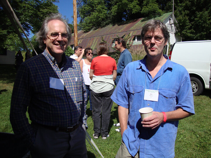
When I found John Williams the morning of our pilgrimage to our art mentor, John Semple -- Its a Gift to be Semple, posted in August -- I was stopped dead in my tracks by John's blue shirt. It wasn't the shirt, it was the color; a near indefinable blue hovering between two hues. I told John that I thought it was an extraordinary blue and he concurred saying that he loved how each part of the shirt, cut from different parts of the bolt of fabric, faded differently.
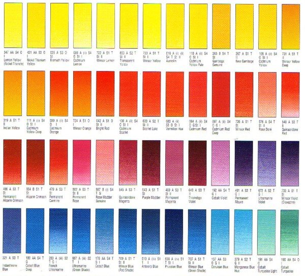
At that point, Jeff Greene, a fellow artist and driver for our adventure asked me what color I thought the shirt was. I said that I thought it was ultramarine with a touch of thalo in it. Jeff said, "Yes it does have red in it." John and I nodded, knowing that ultramarine has a kind of red undertone. After thinking about it, I realized that I would substitute manganese blue for the thalo. The staining power of the thalo would be too overwhelming for this color.John, who is a graphic designer chimed in that he thought it hovered between Pantone 299 and Pantone 279.
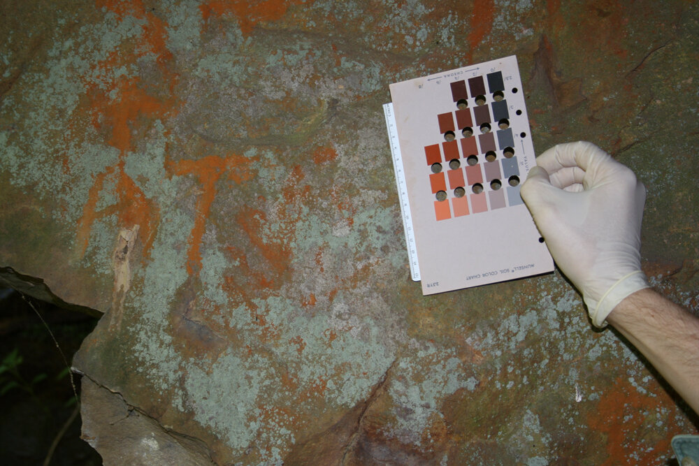
Then Jeff, whose company restores murals and other decorative paintings in historical settings, said that it was Munsell 5PB 5/12 or 6/12. I knew, of course, that Pantone was a color system used by printers and graphic artists to be sure that they have accurately matched up colors between original design and final printed product. Today, since so much graphic design work is done on computer where the accuracy of color from monitor to monitor cannot be relied on, Pantone is the standard used.
I was familiar with Munsell as one of the early color theorists, along with Chevreul and Goethe (yes, the poet -- seems that many of his theories were more poetical than accurate). But I did not know that he had developed a system that "specifies colors based on three color dimensions: hue, value (lightness), and chroma (color purity)."*[Wikepedia]
This system was adopted by the USDA as the official color system for soil research in the 1930s.Jeff said that his company used the system to accurately recreate colors in the walls and ceilings that they restored.
Once on the road, I talked to John about the graphic designer, Carol Jessop, who I had been working with to redesign my website. She went through hundreds of typeface samples before picking the one for my website. I felt it described me well -- very straight forward, no nonsense, but with a surprising curve thrown in here and there and an "e" that was weighted oddly. So, I asked John what typeface he would select for this experience. "Something clean", he said, " but also somewhat elegant." "Like a restaurant with white linen table clothes, " I said. "Yes, but it would be inviting, too. And you could smell the linen. Very fresh." Yes, I thought, that seems right.
Jeff, who was in charge of the sound track for our trip put on Joni Mitchell's Blue -- an anthem from our time at school. But what I heard at that moment was, "I am a lonely painter. I live in a box of paints." Not so lonely now, but still in a box of paints.
And What Color Would You Like:
Munsell Store.com Winsor and Newton Pantone


